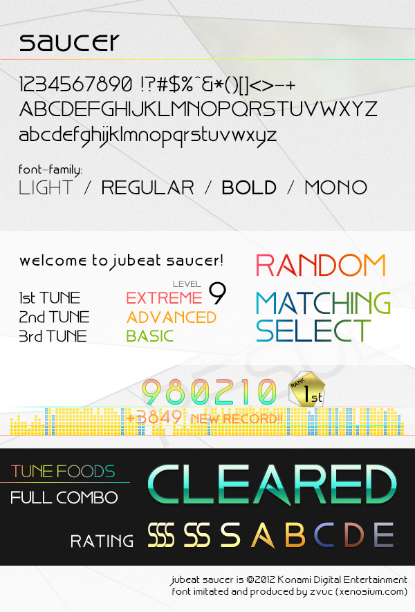
jubeat saucer font
jubeat saucer의 폰트를 제작해보았습니다.
코나미가 이번엔 좀 생소한 폰트를 기반으로 만들었더군요. Bisque라는 폰트인데 인터넷에서도 쉽게 찾기가 힘든것 같습니다. 무료로 배포되는 폰트인듯 합니다. 아무튼, PJMS님의 제보(?)로 본격 폰트 수정작업에 착수, 완성은 지난 4월에 소서 정보가 처음 떴을때 발빠르게 이미 해뒀지만 배포는 벼르고 있었습니다. 그리고 올 9월에 소서가 정식 기동을 시작하고, 인터넷에 올라온 각종 사진들을 기반으로 미세한 부분들을 수정해 폰트를 완성시켰습니다.
일단 최대한 꼼꼼히 비교 대조해가면서 수정했기에 98%정도 오리지널과 비슷하다고 생각하시면 될겁니다. 미세한 커닝/힌팅이나 두께 등은 뭐 어찌 할 수가 없겠지만요(..) 아무튼 제 기준에선 충분히 만족스럽다 생각되어 이제 배포하려 합니다.
공개 다운로드로 올립니다만 저번의 코피어스 폰트때와 같이 개인적 용도로만 사용하셔야하고, 상업적 목적에 이용하시면 안 되고.. 등등 이런건 이제 말 안해도 다들 잘 아시리라 믿겠습니다 ㅎㅎ
그럼, 받아가시는 분들이 어디에 갖다 쓰실진 모르겠지만, 잘 쓰세요!
하루빨리 소서가 국내 정발했으면 좋겠네요. 🙂
the jubeat saucer font.
This time Konami chose a rather unfamiliar font as a base for their brand font customization–a font named ‘Bisque’. It’s kind of hard to locate in the webs, but my fellow friend PJMS somehow managed to identify it and let me know, and right away I started working on it. I actually finished it quite some time ago, just a few days after the official jubeat saucer information (location test) got revealed in April. Then I waited for the official game release in September, just to make sure I have the most accurate imitation of the font (official release=lots of screencaps uploaded for reference!) and voila, font finished.
I do think I am in some aspects a perfectionist, so according to my strict standards, I can assure you the font is 98% similar to the whatever actual font they used in the real game. Of course, tiny details like kerning/hinting/width/stroke weight is out of my power so just take it in mind.
I’ll upload it for public download, but just like the copious font last time, you have to use it only for personal use and not commercial, don’t redistribute it or sell it and blablala, I’m pretty sure you guys already know the rules alright. 😉
Whatever you’re planning to do with the font… have fun with it!
Really hoping saucer will be released soon in Korea too. 🙂
2012.10.12 release initial version 1.1
2012.11.27 Added ‘Mono’ monospace variant
Could I use it as web font?
제보해주셔서 감사합니다.