5분만에 CSS로 큐베 만들어보기
우선 기본적인 HTML 틀을 만들어줍시다. 독타입은 간단하게 흙탕물5로.
<!DOCTYPE html>

<html>

<head>
</head>

<body>

<div class="container">

	<div class="eye left">
		<div class="pupil"></div>
		<div class="highlight"></div>
	</div>
	<div class="eye right">
		<div class="pupil"></div>
		<div class="highlight"></div>
	</div>

	<div class="mouth left"></div>
	<div class="mouth right"></div>
</div>

</body>

</html>
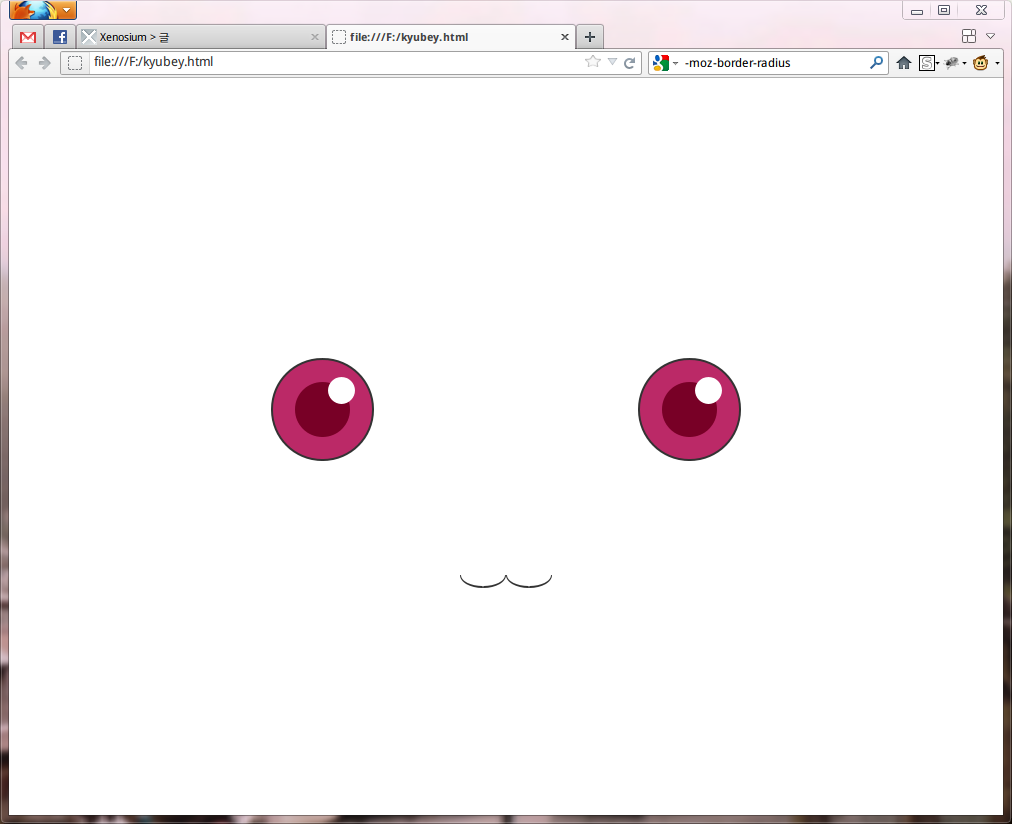
eye는 공통요소로 pupil과 highlight이라는div를 넣어주고 left하고 right만 구분해줍시다. 그 밑에는 mouth를, 마찬가지로 left, right.
body		{ background: #fff; }
.container	{ width: 800px; height: 600px; display: block; margin: 100px auto; background: none; position: relative;}
.container div	{ position: absolute; }
.eye		{ width: 90px; height: 90px; top: 250px;
				border-radius: 50px; -moz-border-radius: 50px; -webkit-border-radius: 50px;
				border: 2px solid #333;
				background: #bb2967}
.left		{ left: 185px; }
.right		{ right: 185px; }
.pupil		{ width: 50px; height: 50px; left: 20px; top: 20px;
				border-radius: 30px; -moz-border-radius: 30px; -webkit-border-radius: 30px;
				background: #780026}
.highlight	{ width: 25px; height: 25px; right: 15px; top: 15px;
				border-radius: 30px; -moz-border-radius: 30px; -webkit-border-radius: 30px;
				background: #fff}

.mouth		{ width: 40px; height: 10px; bottom: 140px; margin: 0 173px;
				border-bottom-left-radius: 35px 20px;
				border-bottom-right-radius: 35px 20px;
				-moz-border-radius-bottomleft: 35px 20px;
				-moz-border-radius-bottomright: 35px 20px;
				-webkit-border-bottom-left-radius: 35px 20px;
				-webkit-border-bottom-right-radius: 35px 20px;
				border: 1px solid #333; border-bottom: 2px solid #333; border-top: none; }
그리고 적당히 CSS를 발라주면
아 잉여하다……..
–English–
그러나 저러나 쩌네요 ㅋㅋㅋㅋㅋㅋㅋㅋ