Smooth Screen Fonts with GDI++!
-
Arial, ClearType -

Helvetica 55 Roman, ClearType -
Helvetica 55 Roman, GDI++
-
맑은 고딕, ClearType -
윤고딕L, ClearType -
윤고딕L, GDI++
저도 몇 주전에 처음 알게 되어서 사용하기 시작했는데, 역시 정말 이쁘고 좋은 것 같아서 소개합니다.. GDI++(지디아이 쁠쁠^^;;)입니다!
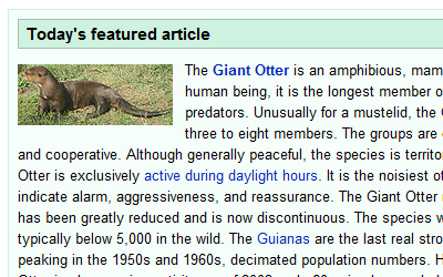
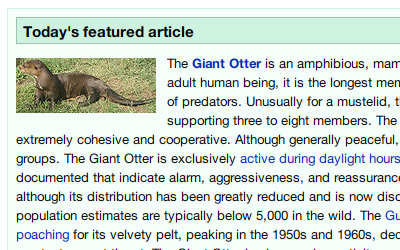
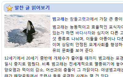
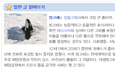
위 스크린샷을 클릭해서 한번 비교해보세요. 파이어폭스에서 위키피디아 메인 페이지를 찍은 것입니다. 차이가 보이시나요? ㅎㅎ
대략 설명
GDI++는 일본의 drwatson씨가 만드신 프로그램입니다. 윈도우의 애플리케이션을 Hooking해서, Freetype이라는 오픈소스 폰트 렌더링 엔진을 기반으로 폰트를 부드럽게 처리해주는 거죠. 설정에 따라 마치 Apple Safari를 켜면 볼 수 있는 그것 처럼 부드럽게 할 수 있다고 하네요.
작은 사이즈의 텍스트에서는 확실히 Cleartype보다는 덜 뚜렷하고 좀 희미해보일 지도 모르네요. 하지만 정말 더 처리된 폰트 결과가 마치 인쇄물과 가깝게 표시되는것 같습니다 .1주일을 써온 저로선, 방금 스크린샷을 찍으려고 잠시 옵션을 끄고 보니 벌써 적응이 되어버린 건지 너무 어색하네요. 🙂
그런데 하나 아쉬운 점은 이 drwatson씨가 개발을 그만두셨다는 것. 그래서 어디 하나 공식적으로 쉽게 접할 수 있는 문서가 없고, 있다 하더라도 일본 페이지들이기에, 상당히 헷갈리는 부분이 있습니다. 인터넷에서 몇몇 사용하는 사람들의 경우에도 실제 어떤 버전을 사용하는지, 그리고 어떤 버전이 최신인지 알 길이 없네요^^:;
사용 방법
일단 제가 사용하고 있는 걸 그대로 압축해서 올려봅니다. RAR파일을 받으신 후 압축을 C드라이브 (또는 원하시는 곳 아무데나) GDI++폴더에 풀어주신 후, 안에 있는 gditray.exe를 실행하시면 바로 시스템 트레이 아이콘으로 나타납니다.
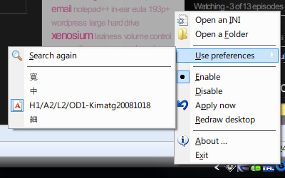
그리고 위 그림과 같이 파란색 G 아이콘을 우클릭 하면 나오는 메뉴에서, Enable을 선택하신 후 Use Preferences메뉴에서 세번째 (제가 만든 설정)을 클릭하시면 됩니다.
설정 변경
폰트 렌더링의 방법이나 두께, 등 여러가지 설정을 바꿀 수 있습니다. 우선 트레이 메뉴의 “Open a Folder”버튼을 클릭 (아니면 압축 푸신 GDI++폴더 속의 ini 폴더)해서, 보이는 2 – copy.ini를 열어주세요. 거기서 수치를 바꾸시면 됩니다. 변경하신 후에는 꼭 ini파일을 저장하고, 트레이 메뉴에서 Apply Now를 눌러주는 걸 잊지 마세요.
자, 그럼 일단은 여기까지입니다.
(아마도) 다음 포스팅에서 세부 설정에 대해서 설명하고, 제가 GDI++에 맞춰 사용하는 폰트들을 소개하도록 하겠습니다.
Click on the above screenshots to enlarge and compare them. They’re from the Wikipedia main page from Firefox… do you see the difference? 🙂
Short Explanation
GDI++ is a program first made by Japan’s drwatson. It hooks running windows applications and uses an open-source font rendering engine named Freetype to smooth the fonts. Depending on your setting, it is said that you can achieve smooth results as in Apple’s Safari browser.
In small-size texts, Cleartype might definitely be the winner, because of the sharp text (It’s what ClearType was designed for after all) But in terms of how the rendered font is close to the actual printed one… GDI++ wins. But anyhow, you’ll get used to it fast. I already used this for a week, and think I’m already used to it so much that when I turned off GDI++ for the screenshot work right above… man it looked so weird without! 😛
One sad thing is that drwatson-san has stopped working on the project. And so his site and the program is not being updated anymore since 2006 which means there is no one specific official documentation about the latest version available on the net. And anyone that seems to be using the program…there’s just no way to know which version everyone’s using. And since most of these users are japanese…. yea, pretty hard for us foreigners to get to use this.
Instructions
Well so anyways, here I upload the one that I’m using now. Download the RAR file, extract it on C Drive (or anywhere you want to) and run the gditray.exe, and voila the icon will apear in your system tray.
Right-click the blue G icon to get the menu like the image above, select Enable; and then in the Use Preferences menu, select the third one (the setting I’ve made) to get everything working.
Changing Settings
You can change the font rendering methods, thickness, gamma, etc and fine-tune the rendered fonts. First click the tray menu’s “Open a Folder” button and open up the 2 – copy.ini (or any other corresponding file, depending on which preference preset you chose the step before) and modify the values there. Make sure you save the ini file, and click “Apply Now” in the tray menu to refresh the render. I’ll write a separate article specifially about the settings and parameters.
이거 원래 이런건가요?
전 쓰면서 그다지 특별히 속도에서 느려진것 느낀 건 없습니다.
작업관리자에서 보면 트레이 프로그램은 평균 900KB정도 먹더군요.
더 먹는다 해도 전 비주얼을 중요시 여기기때문에... ㅋㅋ
설정하기 쉽게 파일 제공해 주셔서 감사합니다. ^^
7에선 바탕화면이나 시작줄은 적용 안되지만 그외 프로그램들은 적용되니 그나마
다행이네요 ㅎ